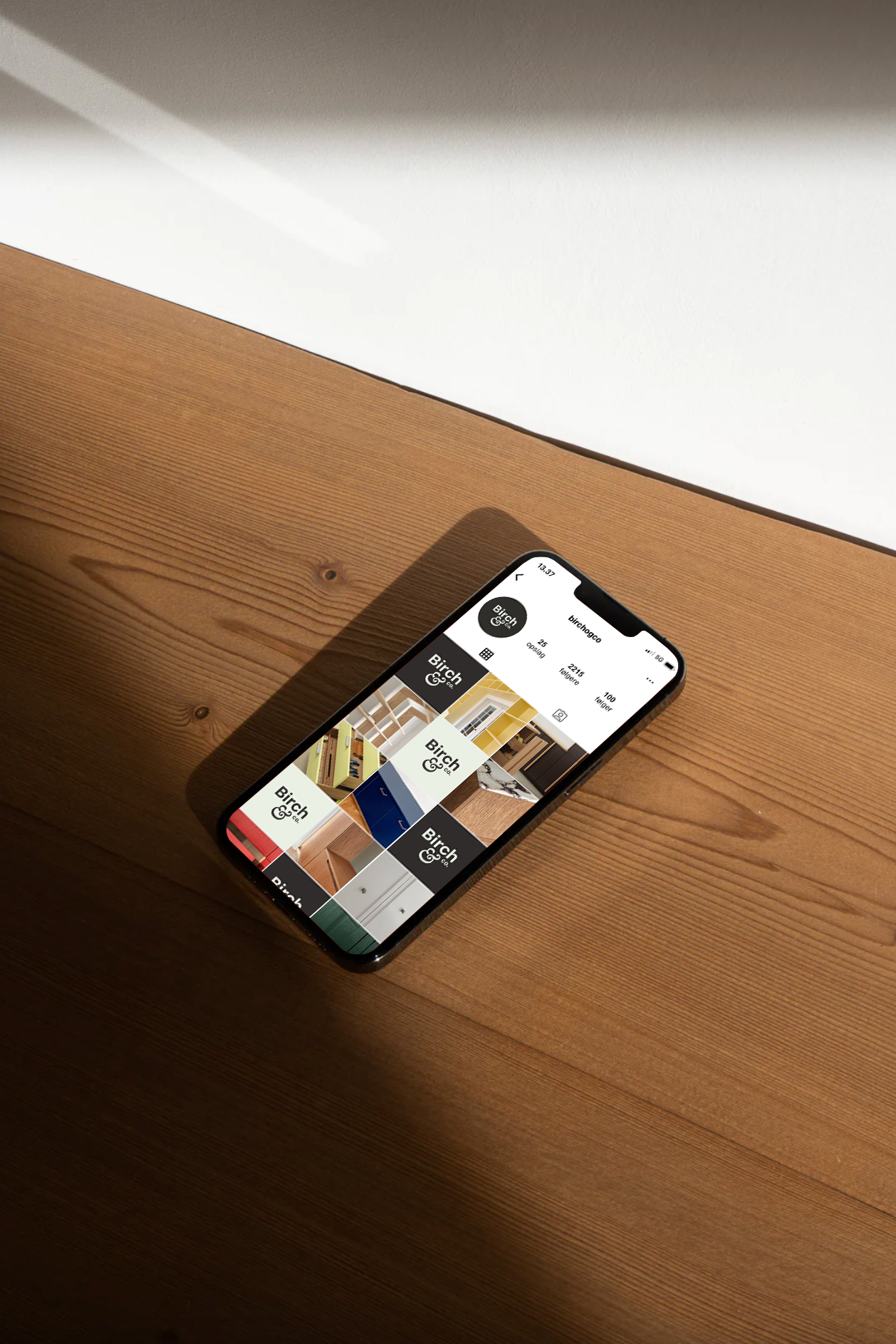
Birch & Co.
Identity Design / 2024
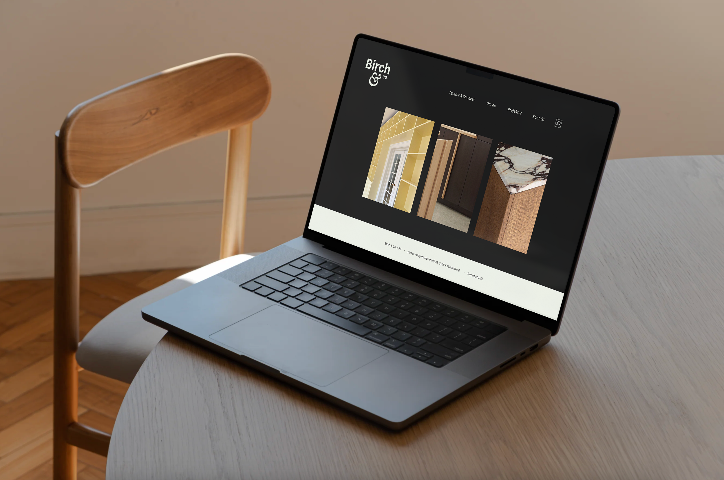
Birch & Co. is a newly established carpentry business owned by Chris Birch — a master carpenter with a keen eye for detail and design. For him, craftsmanship is everything. He wanted a logo that would embody this essence. Additionally, Chris is deeply inspired by Roman architecture, and he asked if it would be possible to incorporate subtle references to that style.
At first, I wondered what Roman architecture could have to do with a carpentry business in Østerbro. But the more I researched, the more I found myself fascinated by the idea. I dove into the world of Roman craftsmanship, and that’s when I stumbled upon the iconic Greek columns with spirals on top. The design was solid, masculine, yet organic, soft, and even a little feminine. It struck me as the perfect balance.
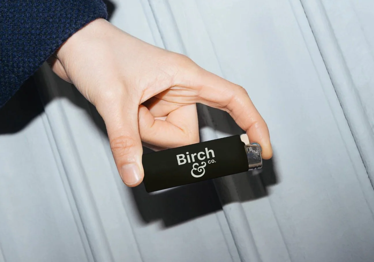
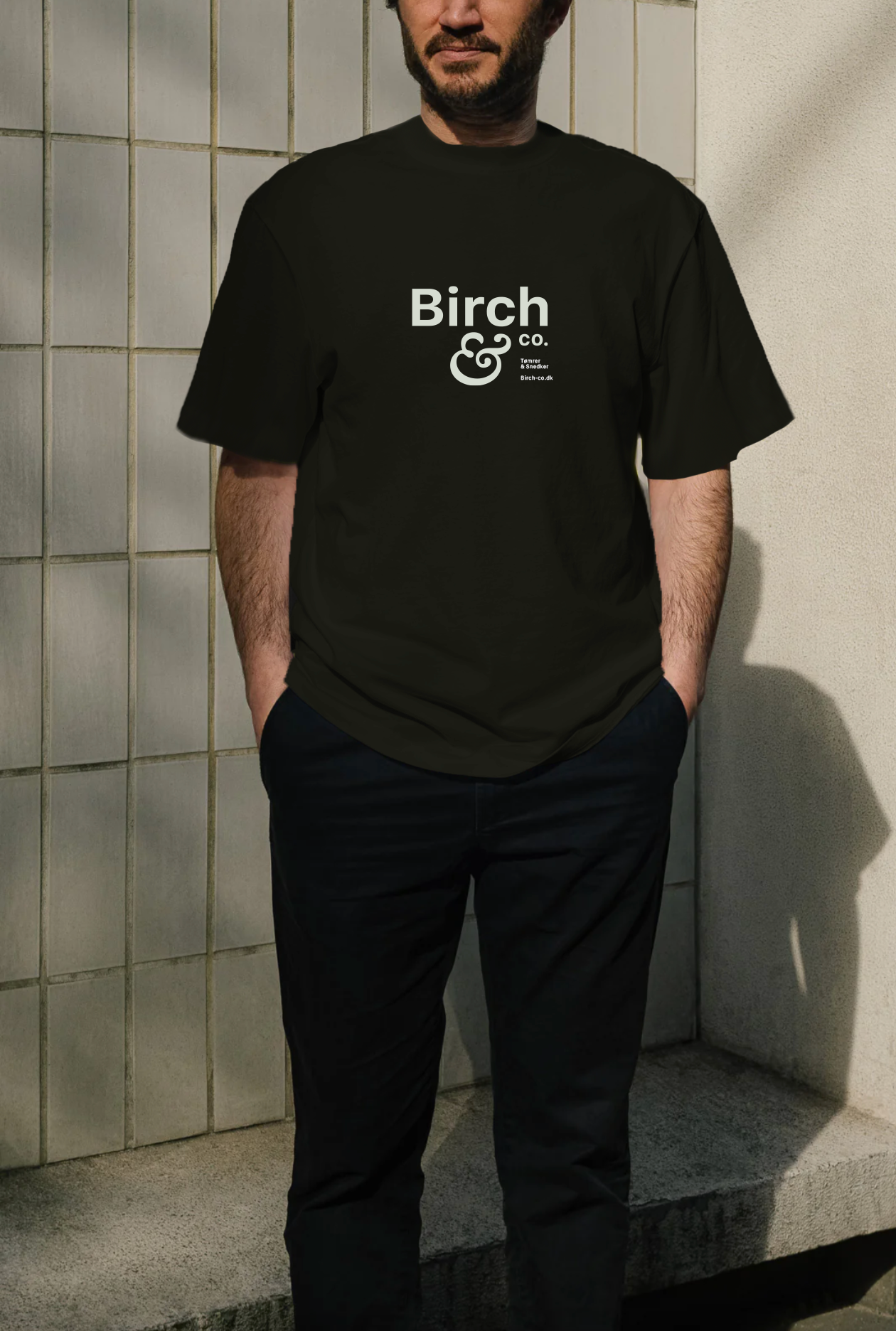
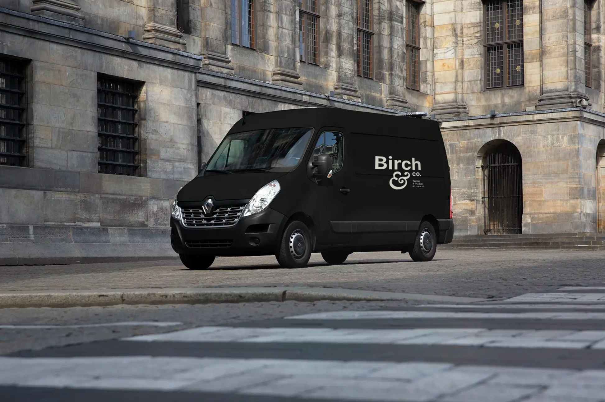
I then created a logo that captured this essence — inspired by the intricate details of Roman columns and the organic rings in the texture of wood. I wanted to merge the organic with the solid, drawing parallels between the delicate craftsmanship of woodwork and the strong, enduring foundation of Roman architecture. The straight, modern font of Birch & Co. adds a sense of timelessness, while the marble-white and soft-black color scheme provides a striking contrast that ties it all together.
The final result? A logo that is simple, yet rich in meaning — masculine yet feminine, organic yet solid — a perfect reflection of the fine craftsmanship that Chris Birch and his business stand for.
Client / Birch & Co.
Visual Direction / Signe Jørgensen


